


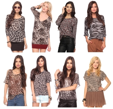
A leopard print is one of the hardest prints to wear as it does require some courage and a slightly more experimentative mindset than your average fashion consumer. But as the saying goes - No Guts No Glory !! The key to successfully incorporating a leopard print top/blouse/shirt or even pants for that matter is striking the correct balance between the leopard print and whatever else you pair it with. Since the leopard print is so "in your face", it should be paired with something a bit more subtle. The Neutral pallet colors like black, white, brown, and beige all work very nicely. However, if you feel that you can get away with more - then by all means try red or even better pink.
Another thing to keep in mind when selecting a leopard print item for your wardrobe is that there are many sizes of the print. It can be bold big print or it can be slightly smaller or delicate print. Also, there is color variation. Leopard print can be anywhere from brown, beige, chocolate, beige, white to red, yellow,purple or green. What you decide on all depends on your personal taste and choice.
Another thing to keep in mind when selecting a leopard print item for your wardrobe is that there are many sizes of the print. It can be bold big print or it can be slightly smaller or delicate print. Also, there is color variation. Leopard print can be anywhere from brown, beige, chocolate, beige, white to red, yellow,purple or green. What you decide on all depends on your personal taste and choice.
A leopard print kaftan such as this one is very comfortable, yet super fashionable. A sheer light-weight fabric makes it feminine and pairing it with some faux leather leggings or pants is great way to balance out the top.
 This is a very interesting way to use the leopard print. In this style, the leopard print is paired with two neutral tones - the black of the pants and the white of the blazer. However what really takes this outfit up a notch is a bright colored collared check shirt. Add a nice pump - and va va voom !!
  If you wish to integrate leopard print into corporate/office wear, you can opt for a beautiful leopard print long sleeved blouse such as this. The other details like the black contrast trim at the collar and the bow add the extra oomph to this shirt. It is very nicely paired with white pants or a white pencil skirt.
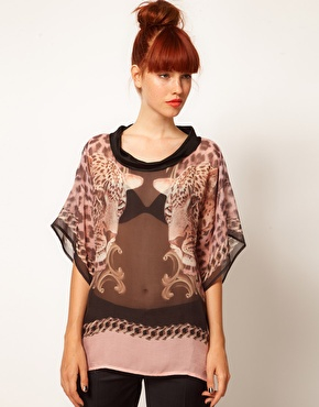
  This particular leopard print top would look great when worn with a pair of your favorite fitting jeans. You can pretty much wear heels and dress this top up or wear flats and dress it down. It depends on how you feel and what the occasion is. The polka dots make for great visual interest and you can look for similar tops where the leopard print is mixed with some other pattern.
 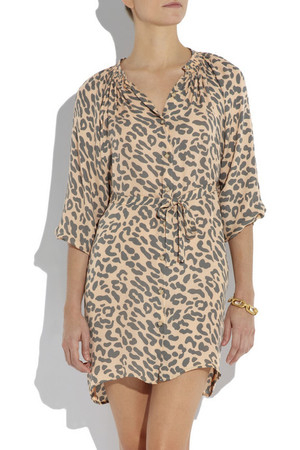 This leopard print dress in a lovely light shade is beautiful, stylish, yet it oozes comfort. So if you are one of those people who really does not wear tight dresses or tops, this one is defo for you. You can add some tights in the winter time and wear your favorite boots, or you can wear some gladiator sandals for the summer time.
  When you muster up the courage to wear a print on your bottom half, then you might as well go for a leopard print. Again this can be paired with neutrals if you want to play it safe , or if you wish to deviate from the norm, you can select different colors and patterns even. But make sure, that the end product does not look chaotic and hodge podge.
  Finally, if you feel like you really want to take baby steps when experimenting with this style- you can opt for a lovely leopard print scarf. While it is mostly worn in the winter time, if you find a lightweight , cool fabric you can also try to wear it in the winter. It is a great conversation piece and you will surely be noticed.


